A dam park - 4/13/19

I was getting into a rhythm, crawl through the workweek not wanting to be at work. Then Friday night hits and start researching local places to go and take pictures. Then go out on Saturday and do exactly that. This particular Saturday had me go to a park that was connected with a hydro plant. A nice place, mostly crowded with children at the actual park part. But it did also have a walking trail through the woods. And the dam on the other side.

Canon 5D Mark II w/28-135mm @28 - 1/100 Sec - F6.3 - ISO 100

Canon 5D Mark II w/28-135mm @28 - 1/100 Sec - F6.3 - ISO 100

At some points along the trail you can see the water. It has a nice quite still part of the Chattahoochee, of course on the other side of the dam it’s a lot faster moving.

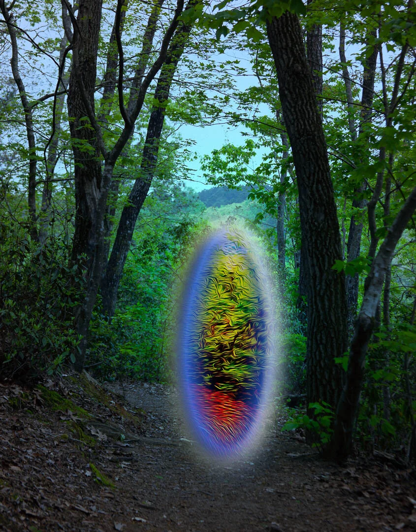
I also took a picture of the forest path, that I decided to play around with in photoshop.

Canon 5D Mark II w/28-135mm @70 - 1/100 Sec - F6.3 - ISO 100

Canon 5D Mark II w/28-135mm @70 - 1/100 Sec - F6.3 - ISO 100

I also came upon the kalmia latifolia, or mountain laurel. Not blooming in April, but pretty nonetheless.

Canon 5D Mark II w/28-135mm @60mm - 1/60 Sec - F5.6 - ISO 100

Canon 5D Mark II w/28-135mm @60mm - 1/60 Sec - F5.6 - ISO 100

Canon 5D Mark II w/28-135mm @300 - 1/4000 Sec - F5.6 - ISO 400

Canon 5D Mark II w/28-135mm @300 - 1/4000 Sec - F5.6 - ISO 400

That one needed a bit of work to get the highlights back, since it was a four thousandth of a second. But shooting any slower wasn’t freezing the water the way I wanted. Very interesting to watch the dam releasing that volume of water so constantly.

I headed back to the car after that point, and just before I got to it a bluebird appeared and flitted around on the tree in front of me. I managed to snag a few pictures of it.

Canon 5D Mark II w/28-135mm @300 - 1/250 Sec - F5.6 - ISO 200

Canon 5D Mark II w/28-135mm @300 - 1/250 Sec - F5.6 - ISO 200

Canon 5D Mark II w/28-135mm @300 - 1/250 Sec - F5.6 - ISO 200

Canon 5D Mark II w/28-135mm @300 - 1/250 Sec - F5.6 - ISO 200

Canon 5D Mark II w/28-135mm @300 - 1/250 Sec - F5.6 - ISO 200

Canon 5D Mark II w/28-135mm @300 - 1/250 Sec - F5.6 - ISO 200

I think the first one is my favorite, with it looking straight up and displaying that nice orange color.

Lessons learned. Calligraphy product photoshoot - 4/1/19

As I mentioned in the previous post, I offered my “services” up to a good friend of my significant other and did a photoshoot of her side business. She does excellent calligraphy for special events, weddings, etc. I highly recommend checking her out on Instagram and her Etsy page.

So I gathered up my gear and headed over. I brought my camera of course, the newly fashioned light box. Some Neweer lights I had got a while back for stop motion animation, my flash, remote trigger. Etc.

We set up the light box on the kitchen table and I got to it. Shot probably 5 or 10 different types of products, with several examples of each. But here was the first mistake, I didn’t think about this from a different perspective. Mainly I should have been thinking about it from HER needs. These pictures should be used to make the product look their best and encourage people to purchase. I was mostly going back to my previous product photography experience, which was partly that but mostly documentation. We would shoot stuff on a white background and just crop out everything that wasn’t the product. Mostly it was stuff made of acrylic so our biggest concern was the flashes reflection.

So while I shot all of her products in the same way, I should have thought about how they would look with just a plain white background. This would get fixed in the next photoshoot I did with her, but for this one I just edited some examples of what I wanted to do. I’ll show those later on.

The next problem I experienced would come to light when I got home and started editing. I didn’t think to check the photos on site, just went with what was on the screen and figured that was good enough. *narrator* “it wasn’t”

Even though I used my two small lights and my flash, the most overpowering light was above the kitchen table. Which as it turned out…

Canon 5D Mark II w/28-135mm @38mm - 1/10 Sec - F4.5 - ISO 100

Canon 5D Mark II w/28-135mm @38mm - 1/10 Sec - F4.5 - ISO 100

Was SUPER yellow lighting. Something I absolutely should have caught while we were there with the products. It really affected the way I could edit them, as you can see the writing was in gold. Which means adjusting the colors was changing the gold calligraphy as well. Which is not what I wanted.

Same image, just edited

Same image, just edited

I did the best that I could, but trying to leave a transparent edge to the acrylic without messing up the color. In the end it was a mess overall and I should have just checked the images when I was doing the shoot. But some of the paper, not acrylic, signs turned out nicely I thought. And there were these neat tile coasters.

Canon 5D Mark II w/28-135mm @ 135 - 1/10 Sec - F5.6 - ISO 100

Canon 5D Mark II w/28-135mm @ 135 - 1/10 Sec - F5.6 - ISO 100

Even though the lighting is uneven, and it’s not as clearly in focus as I would like. All about learning. I tried to edit a couple of these together in a way that seemed, different at least.

Edit of several photos together

Edit of several photos together

It is very distracting how the edges are all lit up unevenly.

Canon 5D Mark II w/28-135mm @122 - 1/8 Sec - F5.6 - ISO 100

Canon 5D Mark II w/28-135mm @122 - 1/8 Sec - F5.6 - ISO 100

Another type of sign she had were these smaller table numbers. These were also acrylic, hence why they seem so off yellow where there isn’t paint. But with this one at least the calligraphy was white, so I could do a bit more color editing. I pulled a stock photo online and threw together a quick edit as an example for what I wanted to try and do the next photoshoot. Since I had done this one so poorly my first inclination was to offer another as soon as we could.

Not my best work at all. Looks very obviously placed in digitally. And trying to get an item that you shot flat on, to appear on an angle. Is not as easy as I thought it might be.

Not my best work at all. Looks very obviously placed in digitally. And trying to get an item that you shot flat on, to appear on an angle. Is not as easy as I thought it might be.

I think I had a bit better luck with the second image I edited into a stock photo.

Canon 5D Mark II w/28-135mm @50 - 1/5 Sec - F6.3 - ISO 100

Canon 5D Mark II w/28-135mm @50 - 1/5 Sec - F6.3 - ISO 100

Same image edited into this stock photo

Same image edited into this stock photo

Although it still is obvious that it’s not a natural picture, I like this one a lot better. I matched the shadow from the sunlight by creating a duplicate of the sign and just made it gray scale and mirrored it onto the table. This one was pretty impressive if I do say so myself, and that was the feedback I got as well. Thankfully something was usable out of this photoshoot so not a total loss. And all the knowledge I gained from my mistakes really came in handy when we got together again for another shoot.

And now for something completely different - 3/31/19

Towards the end of March I had another photoshoot upcoming, this time for a friend of my girlfriends who runs an Etsy shop doing some awesome calligraphy, cards and signs for weddings and special events. This was still a few days away, so I’ll talk more about that next post. But to prepare for this, I ordered some diffusion fabric, strong magnets and much better lights. Or at least bigger and more powerful ones, with color temp controls I really like.

I also did want to make a good showing of myself. I know from a business standpoint having at least somewhat impressive looking setup is going to go a long way. And since I was going to be taking pictures of smaller cards and acrylic signs, I needed an upgrade to the lightbox. The cardboard box with my old undershirt taped over the holes was not going to work. I picked up some small pvc pipe and corner pieces to connect it into a cube shape, cut the fabric to fit all the sides and ignored the magnets for the time being. Didn’t have time to glue them on before the next day. Just draped the fabric over for the time being.

But I needed some practice shots so I started grabbing stuff around my apartment to test the whole setup.

Canon 5D Mark II w/28-135mm @135mm - 1/20 Sec - F13 - ISO 100

Canon 5D Mark II w/28-135mm @135mm - 1/20 Sec - F13 - ISO 100

First up was a colorful dice set I have. I knew I wanted a big depth of field, so a large f stop number. Minimal grain, low ISO. And whatever shutter speed that needed to go along with it. Probably could have tweaked this a bit better so I could get all of the edges in focus. Pretty sure I was using the wireless shutter release, and of course a tripod.

Canon 5D Mark II w/28-135mm @70mm - 1/2 Sec - F22- ISO 100

Canon 5D Mark II w/28-135mm @70mm - 1/2 Sec - F22- ISO 100

Similar concept and theme with the D&D, this time the demogorgon, apparently. Just another cool object from off the gaming collection shelves. Which brings me to the next shot I did, with some amiibos. I had a very specific shot in mind when I was working on this. To recreate the cover art for the Windwaker game.

Canon 5D Mark II w/28-135mm @135mm - 1/8 Sec - F4 - ISO 100

Canon 5D Mark II w/28-135mm @135mm - 1/8 Sec - F4 - ISO 100

I also needed a shot of Ganon for this.

I actually don’t have a raw file for this one. I may have done with the telephoto, but a few weeks later when I got around to editing.

I actually don’t have a raw file for this one. I may have done with the telephoto, but a few weeks later when I got around to editing.

I set a challenge for myself for some photoshop practice. See if I could take those two images, and recreate this.

Cover art.jpg

And…

Amiibos Windwaker cover1.jpg

Hahaha, seeing it again makes me laugh all over again. This was a lot of fun to work on, put several hours into the editing on this. Pulled a royalty free globe that I tweaked heavily to try and match some kind of art style, had a lot of trouble with the clouds until I grabbed my drawing tablet (another hobby now abandoned)

In the end I’m happy with it, it was fun to work on and it’s a fun image to look back at. I did have plans to do one more from one of my favorite games. Which is based on one of my favorite book series. If you like fantasy novels do yourself a favor and try out The Name of the Wind, by Patrick Rothfuss. The second book in the series has mention of a tabletop game the author created within the book. And then brought to life with a kickstarter campaign and another guy who does that kind of thing a lot. The cover art for the game Tak is really cool. Just a shot of the game pieces, probably with a macro lens. I tried and tried and couldn’t get mine just right.

You can look up the box art to see for yourself, I think I did a good job of copying the pieces and their positioning. Just couldn’t get my camera to be wide enough but still keep the proportions. They also had harsh lights coming from the back left of the pieces to create some nice shadows. Can’t really do that when you stick the whole thing in a light box covered in diffusion fabric. But an attempt and failure is better than no attempt at all. Only way you get good is when you fail enough to learn.

Canon 5D Mark II w/28-135mm @135mm - 2.5 Sec - F32 - ISO 100

Canon 5D Mark II w/28-135mm @135mm - 2.5 Sec - F32 - ISO 100